
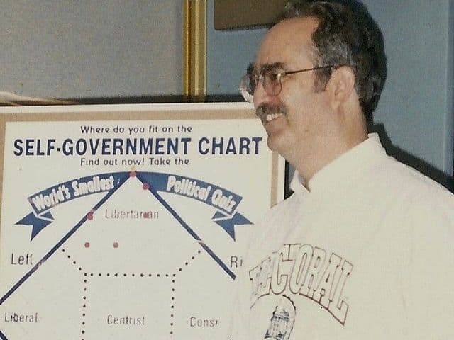
The Nolan chart was created by David Nolan in 1969. A Libertarian, Nolan designed the chart to help people identify where they fall on the political spectrum.
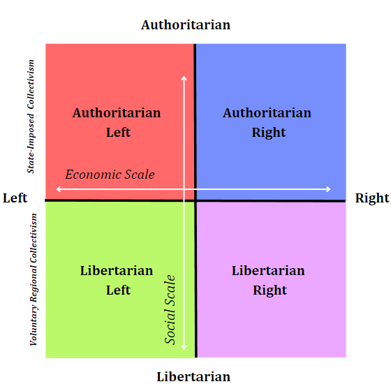
This chart was first made public in Nolan’s 1971 article, “Classifying and Analyzing Politico-Economic Systems.” It is comprised of two different axes: personal freedom and economic freedom.
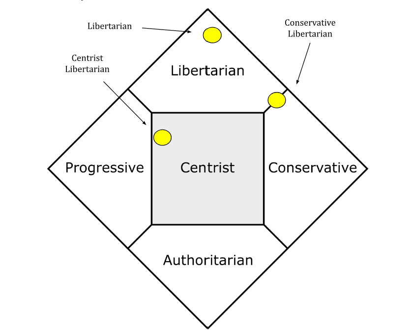
Understanding the Nolan Chart
The Nolan Chart is one of many ways to visualize where individuals fall on the political spectrum, but how does it work? As mentioned above, the two axes are personal freedoms and economic freedoms. Let’s first learn about what these quadrants say about political identity.
Economic Freedom
There are two axes, one that measures personal freedoms and one that measures economic freedom.
The opposite ends of this axis are statism and libertarianism:
- Statism: Those who fall on the left of the economic freedom axis support the states' ability to intervene in the economy. This includes, but is not limited to, support for taxes, government intervention in the market, and government funding of public welfare programs.
- Libertarianism: Those who fall on the right of the economic freedom axis support the government's lack of ability to intervene in private economic decision-making. This includes, but is not limited to, support for little to no taxes, no state intervention in the free market, and little to no economic regulations on the private sector.
Personal Freedom
The vertical axis measures the scale of personal freedoms.
The opposite ends of this axis are two different types of authoritarianism:
- Authoritarian Left: On the bottom of the personal freedom axis are those who support high economic government regulation as a means of achieving personal freedom. At the farthest point on the left, this includes economic models of socialism and communism.
- Authoritarian Right: On the top of the personal freedom axis, are those who support low personal freedoms. At the farthest point on the right, this could look like theocracy and fascism.
Join a community of changemakers
Connect with Independent problem-solvers and explore free resources for launching your campaign
The History of the Nolan Chart
The idea that it is possible to map out political identity predates David Nolan. It started with Hans Eysenck, a British psychologist, who published The Psychology of Politics in 1954.
In this book, Eysenck detailed the ability to pinpoint political identities on the axes of economics and authoritarian-libertarianism. This was later visualized in David Nolan’s 1971 depiction of what is now known as the Nolan Chart.
How to Use the Nolan Chart
The Nolan Chart uses 10 questions (with the option to answer bonus questions) to gauge your political standing. Marshall Fitz, founder of Advocates for Self Governance developed the quiz in 1987 and it was the first quiz every published on the internet! The questions inquire about topics including globalization, labor unions and freedom of speech. Feel free to take this quiz to see where you fall on the political spectrum!
Visualizing the Political Spectrum
Visualizing the political spectrum is incredibly important for a few reasons. It allows you to visualize where you fall on the political spectrum, which can sometimes be a surprise. Seeing where you fall on the political spectrum helps clarify some of your beliefs on government regulations and personal freedoms in practice. For example, if someone sees that they support minimal government intervention and maximum personal freedoms, they would probably identify with libertarianism.
Additionally, seeing how we appear on several political spectrum indicators allows for more clarity on our general political beliefs.
Lastly, having a visual representation of your political identity can allow you to keep track of your views as they change. If you found your political identity on the Nolan Chart in 2018, your results could be very different if you took it again this year.
The Nolan Chart vs. the Binary Spectrum
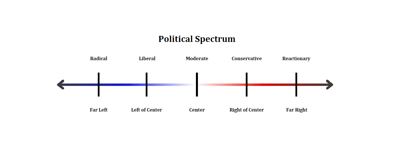
The binary political spectrum linearly represents political identities ranging from radical far-left to the reactionary far-right. The binary spectrum’s greatest strength is its simplicity. It allows you to quickly identify where you are closely politically aligned according to provided categories.
Also, because it is a binary, it can quickly identify those who are on the left of the spectrum and those who are on the right, which, again, is helpful for simplicity. However, there are also some drawbacks. The simplicity of the binary spectrum can be harmful. The oversimplification can be detrimental when identifying policies that people agree or disagree with. The rigid categories make it hard to see the possibility of overlapping beliefs.
The binary chart also labels moderates as the center. However, many people on the far left have criticized moderates for shifting their position farther to the right. Additionally, many people on the reactionary right have criticized liberals for being farther left than they identify. The Nolan Chart is more complex than the binary chart and offers more insight into political leanings.
The Nolan Chart vs. the Political Compass
The political compass and the Nolan Chart both use complex means to determine the political identities of individuals. The Nolan Chart has biases towards libertarianism, which is one reason that libertarianism is located at the highest point of the chart. The political compass does not have similar biases and instead promotes the complexities of various political and economic beliefs.
Additionally, the Nolan Chart is not updated over time to best reflect our evolving political landscape. The political compass is often updated with relevant questions that could be more helpful in determining where a set of beliefs will be seen on the political spectrum. Lastly, the political compass can be more complicated than the Nolan Chart. Sometimes, interpreting one’s results can be difficult, which is why the political compass directs to a custom explanation of one's results; the Nolan Chart does not come with this same explanatory feature, but it isn’t always necessary.
Feel free to use the political compass yourself!
Applications of the Nolan Chart
Where Do U.S. Political Parties Fall on the Chart?
There is diversity of thought amongst all political parties, and this could manifest in members of the same party not always landing in a similar position on the Nolan Chart or other political tests.
The Republican Party
On the Nolan Chart, members of the Republican Party may be located on the conservative side. Conservatives who oppose taxes and government spending on social welfare programs are closer to the top of the conservative quadrant.
However, party membership is complex. A Republican can show up on the Nolan Chart fully in the libertarian section, and that does not mean that they will be rushing to change their party affiliation. Additionally, Republicans can find themselves in the centrist category, finding that their views are more politically moderate than some of their counterparts.
The Democratic Party
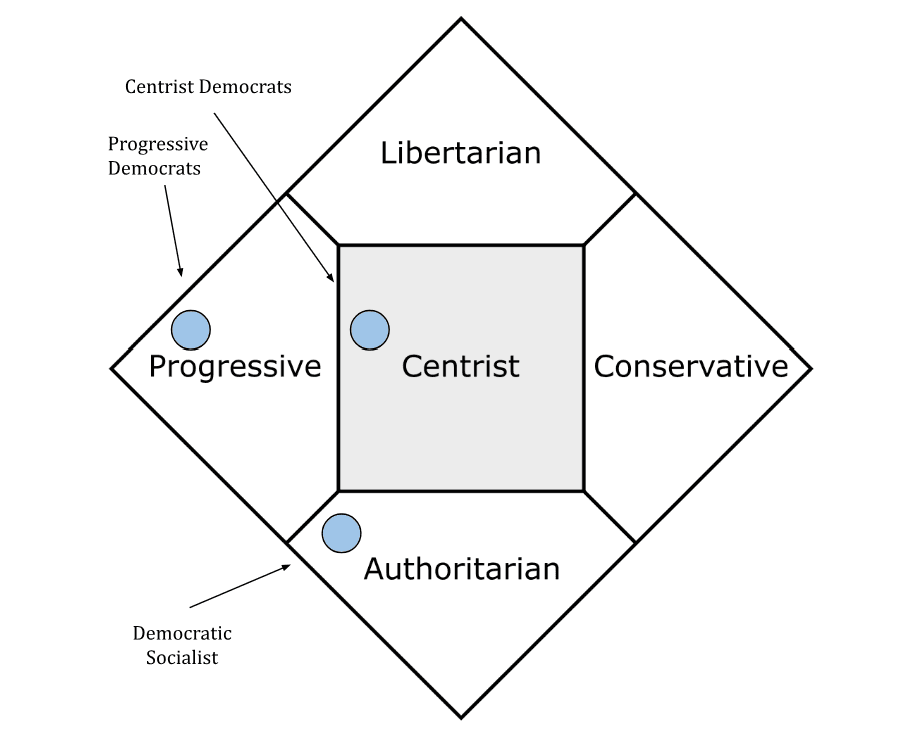
On the Nolan Chart, members of the Democratic Party will likely find themselves on the liberal side of the political spectrum. If they are higher on the top of that section, it means they likely support social welfare but also want to keep government spending and intervention in free market capitalism to a minimum. If they are closer to the bottom of the liberal section, they likely support heavy government intervention in the free market with a strong public sector as well.
Additionally, Democrats can find themselves in the centrist sector. It is not uncommon for Democrats to identify as centrists. Therefore, their perception of personal and economic freedoms could put them in this position.
Secondly, they could have more authoritarian beliefs. This is because not all Democrats completely support free market capitalism. Considering that the party is so diverse, it is very likely that party members identify as social democrats or democratic socialists.
The Libertarian Party
As David Nolan intended, libertarians will often find themselves at the top of the Nolan Chart. Nolan decided that this particular point represented the point on the chart where personal and economic freedoms were the highest. Those who believe in low to no taxes and small government will often find themselves in this sector. Additionally, libertarians can gravitate towards the conservative or liberal side of the political quadrant.
The Green Party
Members of the Green Party will likely be placed in the authoritarian sector, as they believe that the private sector should not take precedence over citizens' needs. Thus, they believe that the public sector should be more in control of distributing goods and services to people. Green Party members would generally find themselves in the middle or leaning to the liberal side of the authoritarian sector.
However, there is one problem here that makes it difficult for Green Party members to be placed. Because Nolan was a capitalist, four of the five sections are more readily associated with capitalism. Authoritarianism, however, is not. The Green Party rejects capitalism in its core documents. To get a more comprehensive reading on their political standing, it may be better for Green Party members to use other political tests to find more clarity.
Going Beyond Red and Blue
Variability within a political party is completely normal. There is no monolithic way to show up politically, including within a political party. The abnormality lies in the expectation that all people will funnel their political beliefs into just two parties. It is simply irrational.
As you begin to inevitably find commonality with people who identify differently than you, remember that it is totally normal. No political quiz should change your life or personality, but it should open your mind to the many things you can have in common with people you would otherwise consider politically different from you.
In search of more information on political parties? Click here to read more about the different political parties that exist, where they stand and how they engage with one another.
Looking for a community of Independent thinkers? Join the GoodParty.org Community and keep the conversation going.
Photo by Carolmooredc; cropped and reused under CC BY-SA 3.0